

adidas Running | Redesign
Medium
Mobile app
My Role
Concept | UX / UI | Visual Language
Timeline
4 weeks, solo project
Redesign of the ‘Join Community Event’ flow of adidas Running, a popular sports tracking app.
Providing different visual solutions to the same UX problem.
DISCLAIMER
I’m not affiliated with adidas in any capacity, and the views for this case study are strictly my own. This case study was done to enhance my learning experience and challenge myself to redesign a specific user flow.
I use adidas Running all the time and it serves me well.
THE APP
adidas Running allows users to track their activities, review their statistics, and connect with the running community
Through the app users can join challenges and share their success with a global community of over 170m people. Over 70 adidas Runners communities around the world use this app as their main tool to connect and manage training sessions & events.

Current adidas Running app
WHY THIS REDESIGN

As a UX/UI designer and an avid runner, I took on a personal challenge to enhance the digital experience of adidas Running
I love running, a lot, and in the last two years I have been doing this with the adidas Runners Tel-Aviv community, which makes adidas Running the main platform we use.
I remember that as a new member I faced a lot of trouble navigating through it and finding relevant stuff. Signing up for a community event still feels cumbersome. Also, the design feels outdated and doesn't reflect the dynamic and enjoyable activity running is.
Ready, Set, GO!
APP ANALYSIS
The different features of the app could be organised & designed in a better way considering the needs of the runners
Since I had already used the app and was familiar with it, I decided to do an in-depth analysis first. I wanted to understand the functionalities, overall architecture and navigation.
Through the analysis, I was able to identify areas of friction and possible pain points of users.
I noticed two main problems:
Basic actions are complicated 🧩
Even experienced users have to navigate through multiple screens just to figure out what the new community events are or find information about past activities.
Lack of “Fun” 🎉
Sport is traditionally represented with vibrant colors loaded with energy. The single turquoise color, over white background, falls short on inspiring one to tie up their laces and run.
After reviewing the app’s main screens, I made a list of the main user flows, so I could better focus the redesign process.
1. Record an activity
2. Join a community event
3. Join a community
4. Share activity
5. Check stats
I choose to focus on the ‘join a community event’ flow due to its usefulness and uniqueness to this running app and the way many runners use it.
Current adidas Running app Pros & Cons I have identified:
Activity (Main Screen)

👍
-
Quick access to the Community screen through nav bar
👎
-
GPS indication doesn't stand out
Tel Aviv Community

👍
-
Quick access to Upcoming Events
👎
-
No main prominent CTA
Community

👍
-
Event cards look dynamic and prominent
👎
-
Must scroll down the entire screen to "Groups & Communities"
Main Screen (Activity screen)

👍
-
Activities and details are clearly shown
👎
-
Items don't look clickable
-
No CTA
Community

👍
-
Friend suggestions nourish a connection to the community
👎
-
Title & button names are redundant
-
Buttons don't look clickable
Main Screen (Activity screen)

👍
-
Join Event Button is prominent
Groups & Communities

👍
-
Different communities are clearly seen
👎
-
Items don't look clickable
-
What does "+" stands for?
Main Screen (Activity screen)

👍
-
Push notification before an activity starts
-
Share an activity - invite friends
👎
-
Click reaction is dull
-
No sync to calendar
PROBLEM
Runners who wish to join a community event go through a discouraging experience of a long & complicated set of actions
Signing up for a community event is one of the app’s major flows, done by users nearly every day. It takes them through a tedious process of 6 screens and several actions, which might cause abandonment.

OPPORTUNITY
How might we (I) help runners find & sign up to their community’s events flawlessly?
And, how can I create an energetic design that sparks runners' motivation?
LOOKING AT COMPETITORS
Vibrant colors loaded with energy
Whether you are lacing up for the first time or you’re training for a marathon, you can find an app - or more like a hundred - that can help you. These days, apps can not only track your run, but also coach you, motivate you, keep you safe and more.
I reviewed top running apps to better understand their characteristics.

Prominent Start button

Location & GPS indication

Social
sharing

Vibrant
colors

Positive feedback
TALKING WITH USERS
Frustrated about the long process of getting to the community events list
I wanted to see if any of my runner friends feel the same, do they also experience the same pain points and how do they use their adidas Running app.
They are all AR (adidas Runners) active members, therefore daily active users of the app. They can be classified as Young Professionals, age 26-34 years old.
KEY INSIGHTS
KEY INSIGHT #1
The most popular feature
'Join Event' is the feature AR members use most often. Since they usually use wearables to track their runs, they use adidas Running app mainly to connect with the community.
KEY INSIGHT #2
Check events daily
Almost all the runners said they check the “community events” once a day, and even more towards the weekend, when new events are usually published.
KEY INSIGHT #3
Update friends about new events
Most runners said they have at least one whatsapp group where they update friends about new events.
KEY INSIGHT #4
Frustrated about the long funnel
Almost everybody showed their frustration about the long process of getting to the community events list, and asked whether I know a shortcut.
KEY INSIGHT #5
Need for a facelift
Runners said they would like to have a dark mode when they use the app through evening training sessions. They also expressed that the app looks monotonous compared to other running apps.
Lay The Foundation
MAIN GOAL
To provide a simple experience that allows users to easily & quickly join a community event
TARGET AUDIENCE
20-35 years old
Students and Young Professionals
VALUES

Healthier
lifestyle

Stay in
control

Save time
& energy
WIREFRAMES
Redesigning the ‘Join Event’ flow
After reviewing the current app’s screens and going through other apps I designed a new layout. Making the necessary adjustments to address users’ main pain points.


Lace Up, Let's GO!
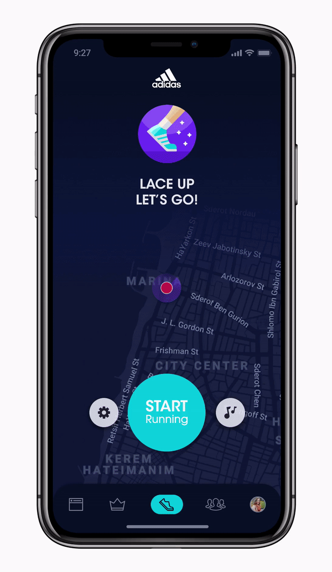
MY FAVOURITE DESIGN SUGGESTION
Vibrant colors loaded with energy
Sport is traditionally represented by vibrant colors loaded with energy, aimed at inspiring one to tie up their laces and run. When designing my own version for the app I preserved the things I liked, and added elements I found to enhance the user experience. Since the users expressed their wish to have a dark mode, adding it was necessary.

%20UI3A.png)
Prominent GPS indication
Eye-catching START
button
The new color palette induces an energetic, motivating vibe
Light & dynamic icons
Illustrated badges
Integrate a game element into the app, with a great potential to motivate individuals to increase their physical activity

Dark background
The dark blue background color helps the brighter colors stand out
Create a group
Revealing a hidden option

Motivating Banner
Invites users to immediately join the event

Motivating tag lines
To the point and easy to understand in a glance
One-time events
Event cards with a dynamic calendar feeling push the user to browse through them
Long-term challenges
Less dynamic cards, for challenges that last longer
CTA at the top
No need to scroll
Friend cards
Mutual friends avatars and a clear "Add Friend" button to increase engagement
User's profile avatar
To increase personalisation

Inviting event banner
Added main CTA to join the community's main event

Motivating pop-up
A positive feedback for the user's registration.
Additional actions
Easily add to calendar or invite a friend - two popular actions among users

PREVIOUS DESIGN SUGGESTIONS
Looking for the creative direction
When re-designing the visual interface, I asked myself - How far should I go? Since this is a real app, should I be constrained by the current visual language? I tried different visual versions looking for my solution.
Here are my early designs:
DESIGN METHODOLOGY # 1
Preserving the original adidas Running visual language
In this design I made only small tweaks and fine-tuned the existing visual language.
%20UI1.png)


DESIGN METHODOLOGY # 2
Using Adidas Runners website's visual language
In this design I implemented AR visual language, as it appears on their website.
%20UI2.png)


CONCLUSION
No matter how good a thing is, it always has the scope for improvement, so let your creativity flow.
Looking back at the entire process, redesigning this app and working on this case study strengthened my notion that a design process never ends, a digital product is like a “living being”, constantly improving and evolving.
The decision to focus on the UI allowed me to practice my ability to offer different design options for the same UX solution, proving how much effect it has on a product.
I enjoyed designing something so close to my heart and sharing it with my runner friends.
